
Introduction.
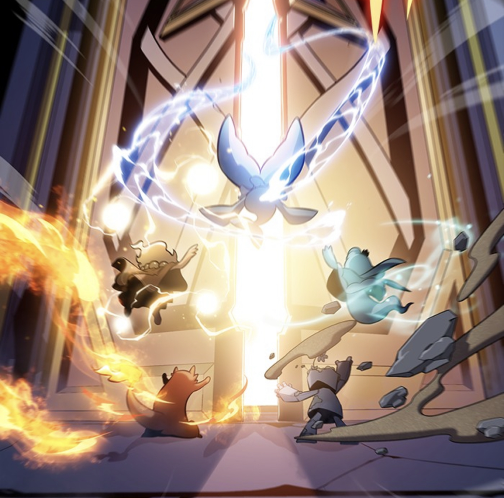
This is an explanation of the “Fire Slash” effect that I created using Niagara in UE5.
In this article, I would like to explain a slash part in the effect.
I will focus more on the artistic aspect of how the fire slash was designed than on the technical details of implementations of Niagara and Materials.
If you are interested in the contents of the implementation and the parts other than the slash in this effect, please take a look at the link below where the UE data of the effect is provided.
https://heyyohanashima.gumroad.com/l/uajdj
目次
- Silhouette of a flame-like slash
- How to create a flame texture and color
- Polish up
- Flame-like vanishing
- Additional
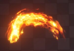
1. Silhouette of a flame-like slash
We often see silhouettes of slashing effects with sharp outer edges and fading on the inside.
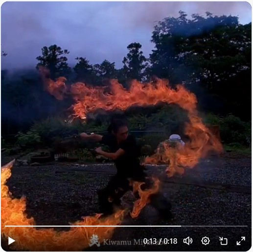
However, in searching for various references, I felt that a more realistic slash of flame could be achieved by shaving both edges of the silhouette, so I decided to use such a silhouette for this work.

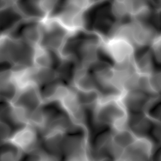
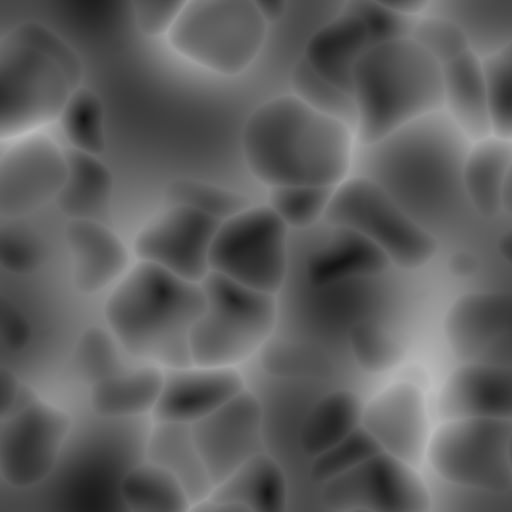
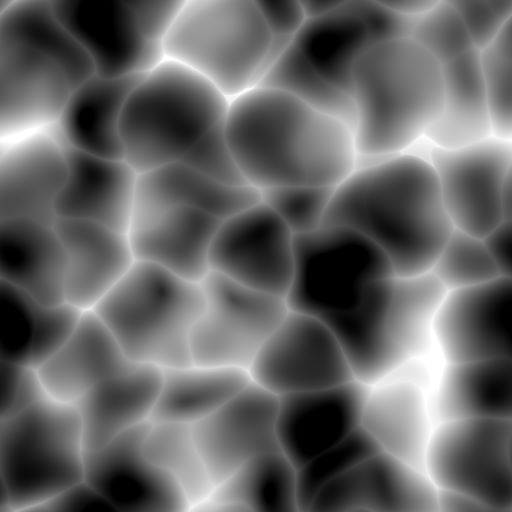
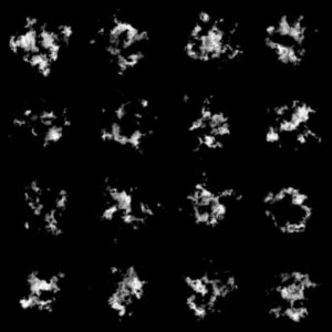
To create a silhouette with both edges shaved off, the base Texture is a simple square mask with faded sides, and it will be UV-distorted with a Voronoi-based noise Texture in a material.

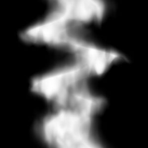
2. How to create a flame texture and color
Voronoi-based Noise Texture, which I also used to create the silhouettes, proved to be a great match for creating the flame-like texture, as Voronoi creates streaky areas with high contrast, which is ideal for creating the organic distortion and stringy color shading of flames. I think.
In this case, I used Voronoi textures from the Substance Designer presets with a slightly adjusted distortion and contrast.
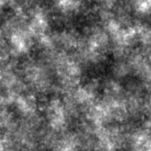
Next is Highlights. As with the flames in the middle of the above reference, I thought it would be good to add highlights with a slightly rough, fire dust-like impression, so I used a fine-grained noise texture and added it to the base to create the highlights. In doing so, I applied Power and Multiply nodes to the output of the Texture Color in material and set both values to high, thereby increasing the value while narrowing the highlight range.
Finally, ColorMapping is done with the texture gradient created so far to add the color of the flames. You can find a variety of flame color gradients on Pinterest by searching for ‘fire color palette,’ so I created a ColorCurve based on those.

3. Polish up
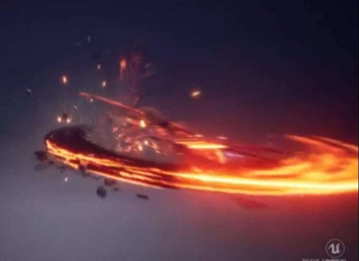
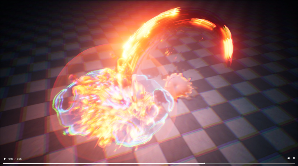
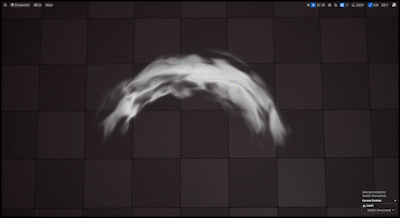
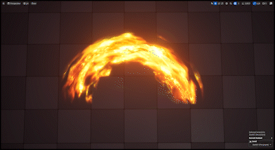
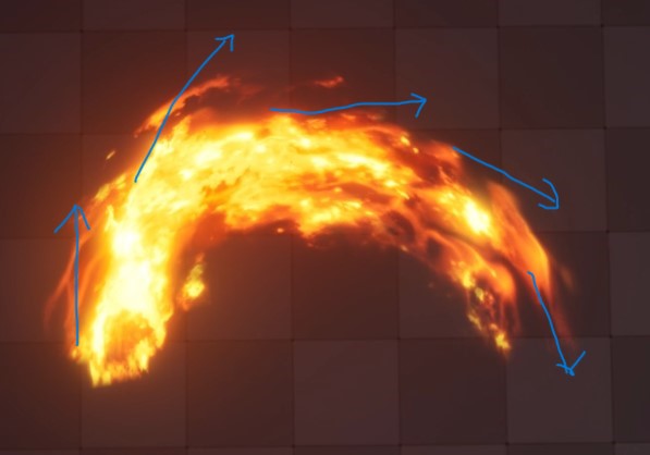
And so, the following flame slash was created at this stage. Now, suddenly, what is wrong with this effect?
Here is a lecture video telling the answer, which very well verbalizes the design principles of game effects.
This video breaks down game effects into the three elements of shape, color, and timing, and provides a clear and easy-to-understand summary of design principles for each, as well as how to differentiate between Real and Stylized tastes.
I will excerpt one of these slides and discuss the answer to the previous question.
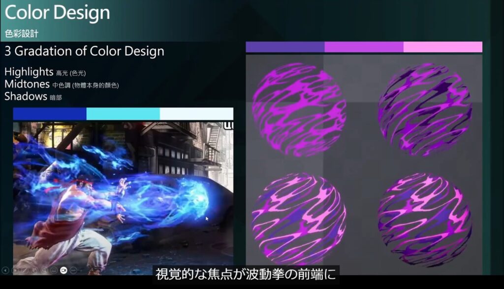
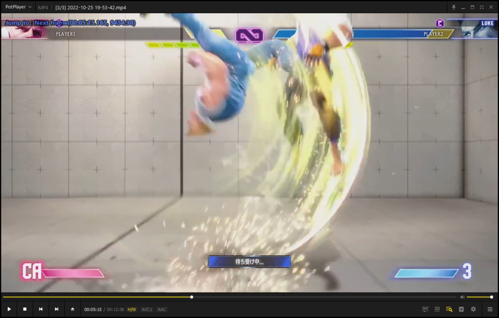
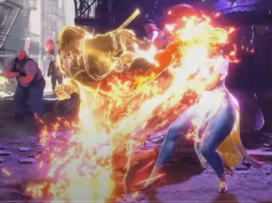
The Hadouken effect in Street Fighter 6 is very well designed in terms of color. The high-energy tip has a strong highlight color, intentionally drawing the user’s eye to the tip, which is the most important part of the move.
So one important aspect of color design is to create color gradations with an awareness of energy intensity and eye guidance.
This point highlights the no-no of the above-mentioned flame slash. In slashing, the tip of the sword flash should have the highest energy, and the user’s gaze should be directed to the tip to help them grasp the sword’s movement.
However, the above-mentioned is a factor that causes the gaze to be scattered, because when the entire image of the sword flash is seen, the entire image is uniformly luminous, and on the contrary, the tip is seen where it is darkened.
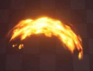
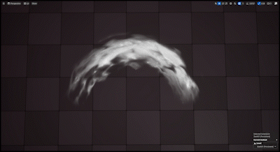
And here I polished it up.
In the improved version, the Emitter was separated for highlights and adjusted to move faster than the underlying slash, with a stronger emission, so that the gradation from the tip to the end is clearer and the eye is directed to the tip.
In addition, apart from the color design, to break the overall silhouette and eliminate the mesh feeling, another mask texture for the silhouette was added for the highlight, and two Particles with different Scale, Position, and Timing were Applied.

Finally, another darker underlying slash is created to represent Highlight/Midtone/Shadow with separate Emitters for each.
4. Flame-like vanishing
Another twist is added to express a flame-like appearance.
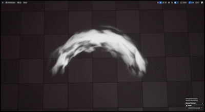
As the flame moves at a fast speed and extinguishes, it appears to spread and disappear, partly due to centrifugal force.
To express this, the width of the mesh is widened when disappearing with World Position Offset.
In addition, by changing the intensity of the UV-Distortion and the scale of distortion texture, a fluid-like texture movement, not a simple Texture Scroll, is slightly added when the texture disappears.
※Fluid-like motion caused by changes in UV Distortion intensity and Scale are explained below.
It is a small device, but I think it strengthens the impression of flame-like quality a little by comparison.
5. Additional
If we only use mesh to express sword flashes, the volume is weak and there is a limit to how much the silhouette can be broken up without mesh shape feeling, so we have created particles of flame and smoke to match the trajectory of the sword flashes.
In this case, if the Particles are simply produced in accordance with the trajectory without any effort, the Particles themselves may contribute to a monotonous silhouette, so it is necessary to pay attention to how they move and disappear.
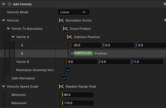
In the movement of the Particle, the Particle is given a small amount of speed in the opposite direction of the slash’s movement, as if the Particle were left behind.
In the vanishing process, to avoid a rounded silhouette as much as possible, we clearly differentiated the contrast of the texture and added a fluid-like motion to the vanishing process as described above.
I think there is room for a little more brushing up in this area, but I will leave it at that for now.
Lastly
I think many blog posts on Vfx tend to be technical content, although I can’t find many articles focusing on the design itself.
Vfx often requires a lot of knowledge on the technical side, but since artistic expression is realized through both technical and design aspects, I would like to see more articles explaining not only the technical aspects but also the design aspects!
In this article, I have introduced the trial and error of the design aspect and the Texture I actually used. If you are curious about how the actual implementation is done or interested in the creation of parts other than the fire slash, please take a peek at the UE data provided below for this individual work!
https://heyyohanashima.gumroad.com/l/uajdj


Damn, this effect looks amazing and your tutorial is phenomenal! Thanks a lot for all this. I ended up here by pure chance and apparently I’ve hit gold haha.
I’d love to see more VFX from you in the future!
Cheers 🙂